How to Read Candlestick Charts? A Web3 Native’s Guide to Market Sentiment
What Are Candlestick Charts?
Candlestick charts originated in the rice markets of Japan’s Edo period and have become a standard tool in global financial markets. Each candlestick represents price movement over a specific time interval—such as one minute, one hour, one day, or one week. Each candlestick displays the following key data:
- Open price
- High price
- Low price
- Close price
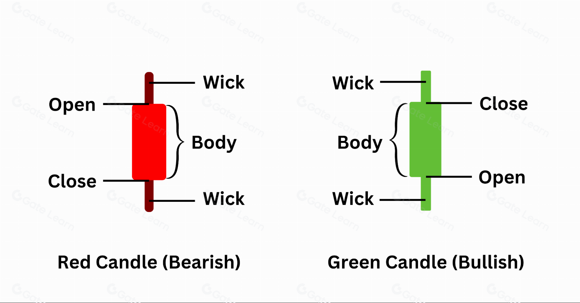
(Basic structure of a candlestick chart)
These four prices define the structure of each candlestick:
- Bullish candle (green): The close is above the open, indicating upward price movement.
- Bearish candle (red): The close is below the open, indicating downward price movement.
The main portion of the candlestick, called the “body,” has thin lines above and below known as “wicks,” which show the full range of price fluctuations within the chosen period.
How to Interpret a Single Candlestick
For example:
- If a bullish (green) candlestick has a long lower wick, it means that although the price dropped significantly during that period, buyers drove the price back up and it closed higher. This reflects strong bullish momentum and active buying interest.
- If a bearish (red) candlestick has a particularly long upper wick, it indicates that prices rose but then declined due to strong selling pressure, resulting in a lower close and signaling bearish control.
The relative lengths of the wicks and the size of the body help traders distinguish between market indecision and potential trend reversals.
Decoding Common Candlestick Patterns
- Hammer: Features a long lower wick and a short body, typically appearing at the bottom of a downtrend. Indicates that buyers are entering the market and a rebound may follow.
- Shooting Star: Characterized by a long upper wick and a short body, often found at the top of an uptrend. Suggests weakening buying power and the possibility of a downward reversal.
- Engulfing Pattern: The body of the second candlestick completely engulfs that of the previous candlestick. This signals a strong potential trend reversal in the direction of the engulfing candle.
- Doji: The open and close prices are nearly identical. Indicates market indecision and a period of consolidation or a potential turning point.
- Three White Soldiers / Three Black Crows: Three consecutive bullish (green) or bearish (red) candlesticks. This pattern demonstrates a strong, sustained trend, but it may also precede a sharp reversal if momentum becomes excessive.
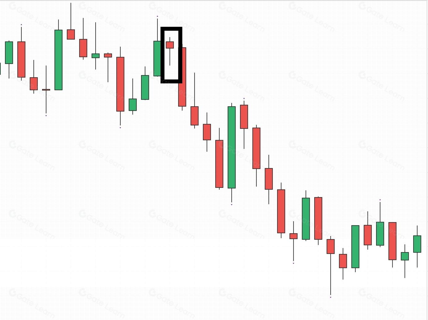
(Hammer pattern)
These patterns are not predictive guarantees; they are analytical tools that support probability-based trend assessment.
The Market Forces Behind Candlesticks
Analyzing candlestick charts alone can lead to overlooking the true strength behind price movements. Incorporating volume analysis provides deeper insight into whether trends have genuine trading support:
- Rising price with increasing volume: Indicates robust bullish momentum and a healthy uptrend.
- Falling price with declining volume: Suggests weak selling pressure, increasing the likelihood of a rebound.
- Volume spikes at turning points: May signal major holders selling or accumulating positions, warranting closer attention.
In the Web3 market, especially for low-liquidity tokens, analyzing both volume and price is even more critical.
Effective Use of Different Timeframes
- Daily/weekly charts: Suitable for identifying medium- and long-term trends and planning entry or exit strategies.
- 4-hour/1-hour charts: Commonly used by swing traders to set stop-loss and take-profit levels.
- 15-minute/5-minute candlesticks: Ideal for short-term or high-frequency traders to track capital flows.
Using multi-timeframe analysis can significantly improve your strategy’s success rate. For example:
- Use the daily chart to identify the overall trend.
- Use the 4-hour chart to find entry points.
- Use the 15-minute chart to confirm reversal signals.
Common Pitfalls and Practical Strategies
- Candlestick charts record market behavior and help interpret current conditions—they do not predict the future.
- Avoid making trading decisions based on a single candlestick. Combine analysis of overall trends, volume, and pattern structures for a comprehensive strategy.
- Price action in small-cap or meme coins is easily manipulated. Verify breakout moves by cross-referencing on-chain data and transaction activity.
- Always implement risk management: Even with a strong view, set stop-loss orders to protect your capital from potential misjudgments.
To learn more about Web3 and digital assets, register now: https://www.gate.com/
Summary
Candlestick charts provide a comprehensive record of market sentiment, reflecting the ongoing dynamics between buyers and sellers. Whether you focus on NFTs, DeFi protocols, or Layer 2 solutions, the ability to interpret candlestick patterns is an essential skill in the Web3 ecosystem. Mastery of candlestick analysis enables market participants to discern underlying logic, sentiment, and rhythm beyond simple price fluctuations.
Share
Content
Related articles

Pi Coin Transaction Guide: How to Transfer to Gate.io

What is N2: An AI-Driven Layer 2 Solution

Grok AI, GrokCoin & Grok: the Hype and Reality

Crypto Trends in 2025

How to Sell Pi Coin: A Beginner's Guide
